
An accessible application must enable full keyboard navigation and control in order to support those users who are unable to use a mouse.
Not only is keyboard navigation imperative for accessibility, but it also enhances the experience of able users. Imagine you were using an application that did not support standard keyboard shortcuts. For example, suppose you could not use the "Ctrl+C" shortcut to copy text and the "Ctrl+V" shortcut to paste text. Or, imagine you could not use the Tab key to move focus from one element to another. Not only would it be frustrating, but it would probably take far longer to use the application than it would with keyboard navigation and shortcuts.
This section describes how to enable full keyboard control by setting the tab order for the elements in your application and incorporating keyboard shortcuts using accelerator and access keys.
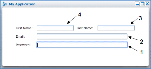
By default, the Boxely UI Toolkit sets the tab order for each "focusable" box within an appWindow based on the order in which it is listed. To override the default tab order, you can use the tabIndex attribute, as shown in the following example:
<vbox s:position="fixed" s:top="center" s:left="center"  >
  <hbox s:vAlign="center">
    <label id="firstName" value="First Name:" s:width="60"/>
    <input value="" s:width="15"  tabIndex="4" />
    <label id="lastName" value="Last Name:"  s:width="60"/>
    <input value="" s:width="15"  tabIndex="3" />
    </hbox>
   <hbox s:vAlign="center">
    <label id="email" value="Email:"  s:width="60" />
    <input value="" s:width="300"  tabIndex="2" />
   </hbox>
  <hbox s:vAlign="center">
    <label id="password" value="Password:"  s:width="60" />
    <passwordInput value="" s:width="300"  tabIndex="1" />
  </hbox>
</vbox>
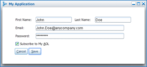
Running a scene with the code above results in the following tab sequence:
If you establish a tab order and then find you need to add a new element at the beginning of the sequence, you'll have to reset the tabIndex for all elements. As a result, it is strongly recommended that you specify the tab order for your application only after the majority of the development work is complete.
Keyboard shortcuts are incorporated into Boxely applications using accelerator keys and access keys.
An accelerator key is a key or key combination that, when pressed, carries out some action in the application. Examples of standard accelerator keys are:
"Ctrl+P" to print
"Ctrl+S" to save
"Ctrl+C" to copy
And so forth
An access key is a single key that is associated with a specific element in an application, such as a menu item, button, check box, or radio button; it is used to select, and in some cases deselect, the element with which it is associated.
Both accelerator and access keys are explained in detail in the following sections.
The following instructions demonstrate how to work with accelerator keys.
To include an accelerator key using a reaction:
To include an accelerator key in your application, add a reaction that listens for the keyPress event, as shown in the following code:
<reaction event="keyPress" ctrl="true" keyCode="P" action="openPrintDialog();"/>
In this example, "Ctrl+P" is the key combination that invokes the openPrintDialog function, a JavaScript function defined in the application's corresponding JavaScript file.
To include an accelerator key using a keyGroup:
If you don't wish to use a reaction, you can use a keyGroup that references a command:
<commandGroup>
  <command id="cmdPrintDialog" action="openPrintDialog();"/>
</commandGroup>
<keyGroup>
  <key id="printDialog" ctrl="true" key="P" command="cmdPrintDialog"/>
</keyGroup>
In this example, "Ctrl+P" is the key combination that invokes the cmdPrintDialog command.
Using a keyGroup is generally recommended over using a reaction as it allows you to associate a command ID with your shortcut and thus eliminates the possibility of specifying a function handler in multiple locations in your code.
To specify accelerator text in a menu item:
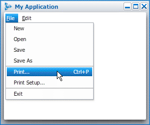
If the action or command invoked by an accelerator key is available as a menu item in your application, you can specify the key combination using the accelText attribute. For example, to associate the "Ctrl+P" keyboard shortcut with the File > Print menu item, use the following code:
<menuBarItem label="<u>F</u>ile" topLevelMenu="true">
<menuPopup id="File">
<menuItem label="New"/>
<menuItem label="Open"/>
<menuItem label="Save"/>
<menuItem label="Save As"/>
<menuSeparator/>
<menuItem label="Print" accelText="Ctrl+P"
command="cmdPrintDialog"/>
<menuItem label="Print Setup"/>
<menuSeparator/>
<menuItem label="Exit"/>
</menuPopup>
</menuBarItem>
An application with the code above presents the following popup File menu:
Unlike accelerator keys, which are defined for global use, access keys are defined for specific elements in your application, such as menu items, buttons, check boxes, and radio buttons.
The following instructions demonstrate how to work with access keys.
To specify access keys for menu items:
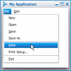
To specify access keys for menu items, simply add the accessKey attribute to the menuBarItem and menuItem tags, as shown in the following code.
<menuBar>
<menuBarItem label="File"  accessKey="F" topLevelMenu="true">
  <menuPopup id="File">
    <menuItem label="New"/>
    <menuItem label="Open"/>
    <menuItem label="Save"  accessKey="S" command="cmdSave" />
    <menuItem label="Save As"/>
    <menuSeparator/>
    <menuItem label="Print"  accessKey="P" command="cmdPrint" />
    <menuItem label="Print Setup..."/>
    <menuSeparator/>
    <menuItem label="Exit"/>
  </menuPopup>
</menuBarItem>
</menuBar>
In the code above, the user can press "Alt+F" to open the File menu; in addition, when the File menu is selected, the user can press the "S" or "P" key to call the cmdSave or cmdPrint command, respectively.
By adding the accessKey attribute to menu items, the Boxely UI Toolkit automatically underlines the key in the item's label, as shown in the following graphic.
To specify access keys for buttons:
To specify an access key for a button, simply add the accessKey attribute to the button tag, as shown in the following code.
<button label="Save" command="cmdSave"  tooltip="Save Changes"
     accessKey="S" />
In this example, when the button is in focus, the user can press the "S" key to invoke the cmdSave command.
By adding the accessKey attribute to an button, the Boxely UI Toolkit automatically underlines the specified key in the button's label, as shown in the following image.
To specify access keys for check boxes:
To specify an access key for a check box, simply add the accessKey attribute to the checkButton tag, as shown in the following code.
<checkButton id="check1" label="Subscribe to My AOL" accessKey="A" />
In this example, when the element is in focus, the user can either press the space bar or the specified access key ("A") to select and deselect the check box.
By adding the accessKey attribute to the check box, The Boxely UI Toolkit automatically underlines the specified key in the check box label, as shown in the following image.
To specify access keys for a radio button:
To specify an access key for a radio button, simply add the accessKey attribute to the radioButton tag, as shown in the following code.
<radioButton label="New Member" value="newMember" accessKey="N" />
In this example, when the element is in focus, the user can select the radio button by pressing the specified access key ("N").
Unlike the check box, a radio button's access key cannot be used to deselect the radio button. If your application includes a radio box with multiple radio buttons, however, the up and down arrow keys will allow the user to change his or her selection.